Hello,
I would love to see Cryptomator adopt the native macOS title bar to make the UI more aesthetically consistent with the OS.
Apologies for such a nitipcking request, but I didn’t see it brought up in this forum or in GitHub. I started using Cryptomator just today and it’s already indispensible for me.
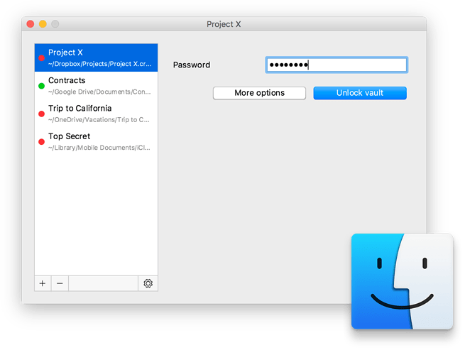
I did some further research on this subject and according to this Wayback Machine snapshot just prior to 1.5.0, Cryptomator used to adopt the native macOS title bar until the 1.5.0 UI redesign.
According to the blog post Cryptomator 1.5.0 Release,
One goal of the redesign was to make the onboarding process easier for users who don’t feel too comfortable with encryption software.
But I can’t help but feel like the result did the opposite. Personally I find the custom title bar alien and distracting, while the old UI looks welcoming and instantly familiar because it is what Mac users expect everytime they install a new app:
Out of the ~200 apps on my Mac, all except Cryptomator use the native title bar, even those with highly custom UI such as Kontakt or Blender.
I hope the dev team would consider re-implementing the native title bar in the future. Again, thank you for creating this outstanding tool!
